

Logo

Logo Concept Exploration
The Brief
We started GettaBite with a complete rebrand. They needed a new look and feel that was youthful, bright and modern. A clean and simple but memorable icon was a must, and a feeling of optimism was key to setting the right tone for the audience.
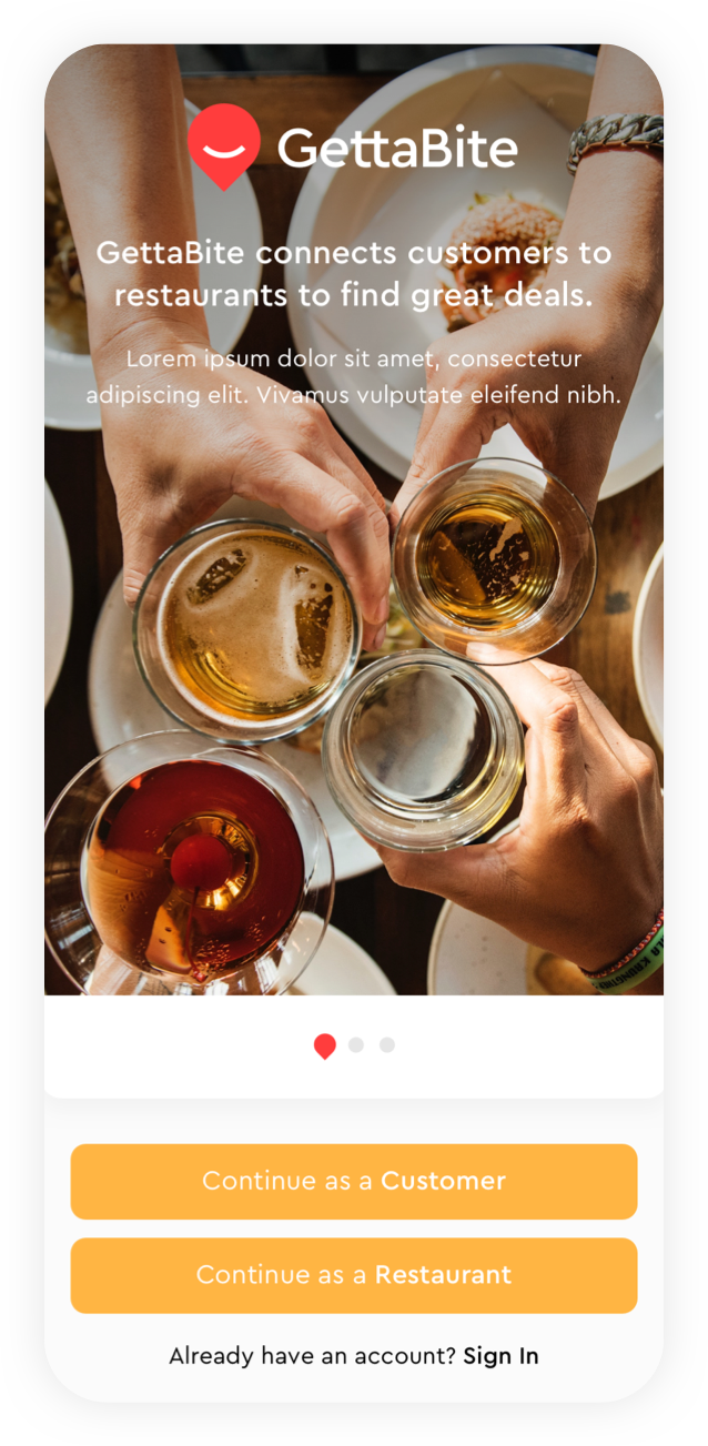
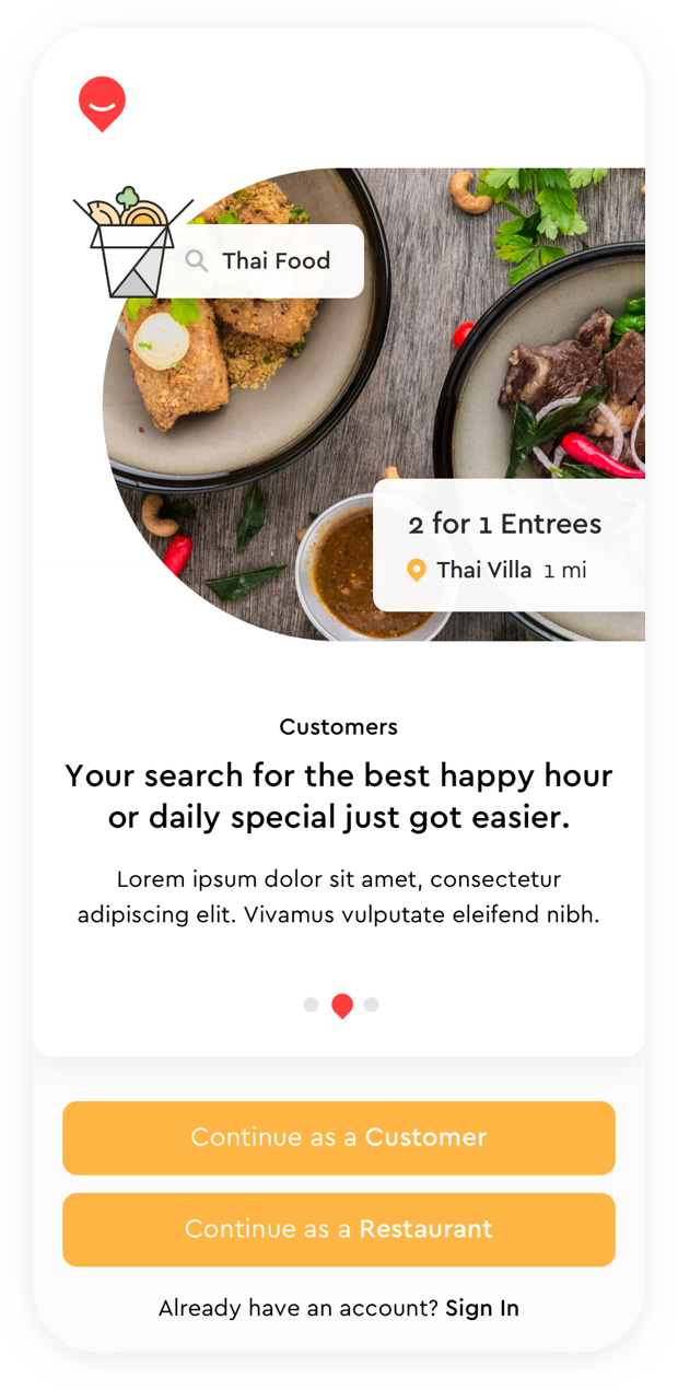
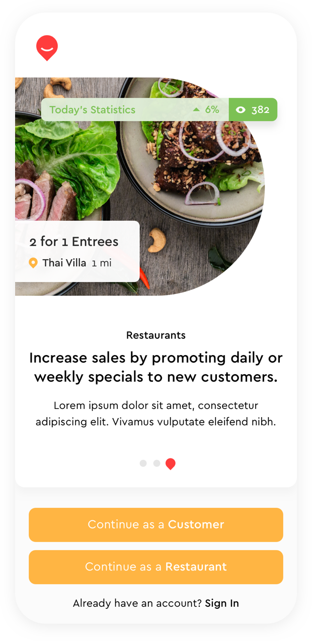
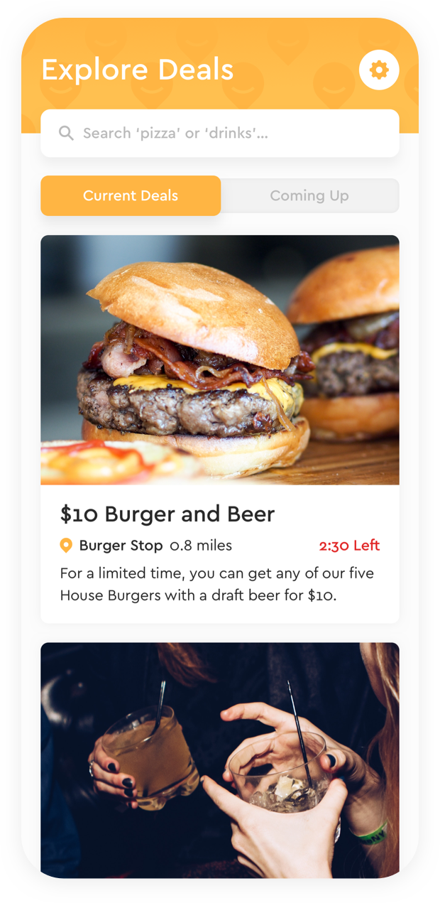
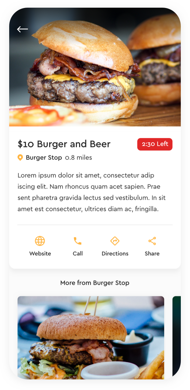
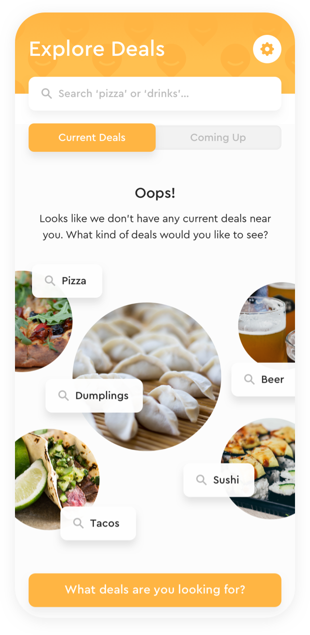
We brought the brand to life while designing the app. We focused on simple ways to improve their existing MVP through good UX and simplicity in design. They were looking for a clean, but tactile aesthetic; something that felt modern but had really unique elements.
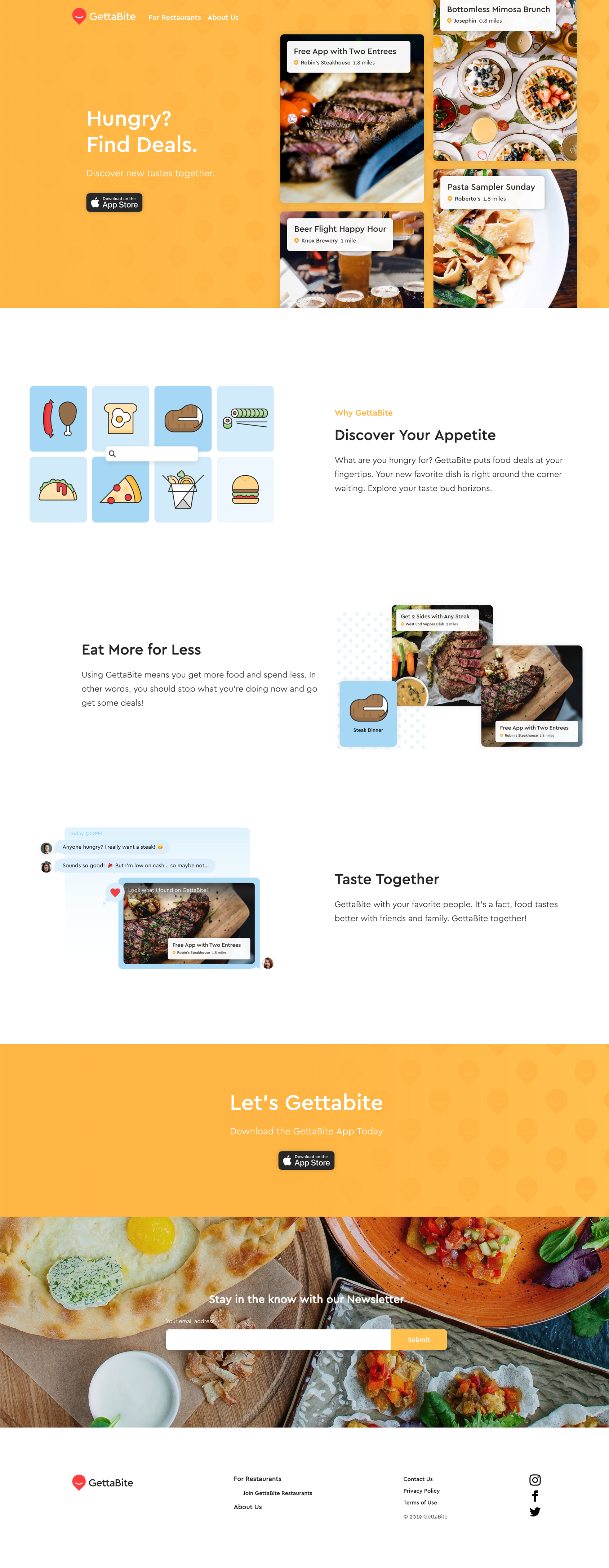
We also created a simple marketing site (built and designed in Webflow) where we introduced fun icons and illustrations and an expanded color palette.

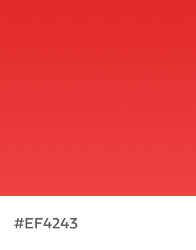


Brand Color Palette

