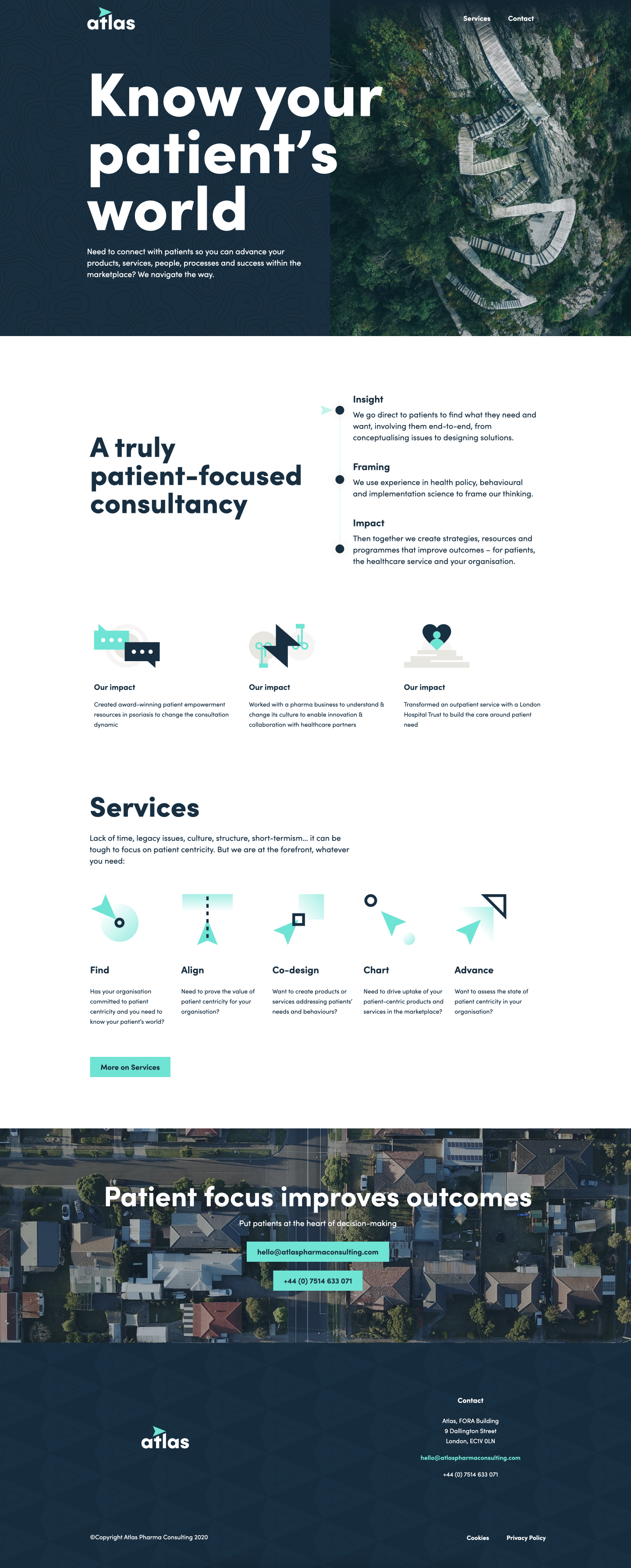


Brand Tagline
Brand Service Icons
The Project
Atlas is composed of a group of experts obsessed with the idea of 'patient centricity', and creating a human-focused brand that lives beautifully online was their goal.
While we explored a handful of interesting brand themes, we landed on a brand direction that falls in sync with their name and was centered around the concept of navigation.
From their logo itself to every other brand touchpoint, we infused the theme of exploration. Instead of stale, medical stock photos we used flat vantage point photos of nature that have been 'touched by humans' to create a more abstract, interesting frame of reference.
The team needed some additional marketing materials including a brochure, but in an effort to make this touchpoint more digitally native, instead we created a series of 'digital brochures' as landing pages on their website that are a much better experience for the end user.
The project was extensive, consisting of a brand, full website (designed & built in Webflow), set of brochures, whitepaper, brand guide and some print marketing materials to come soon.


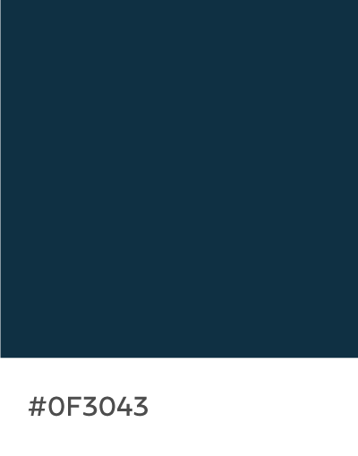
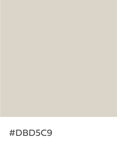
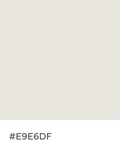
Brand Color Palette

